Where Halifax have failed on their web site
We have kind of assumed that banks are mostly very slow at doing things so a couple of years ago when Halifax released their new web site (and disabled some of the old functionality a few months before it was available on the new site!) I expected a shiny fresh, up-to-date site using the best of the web etc.
What I saw was not really very impressive. After having a go at Argos the other day, I only thought it fair to point out where other people have also badly failed!
Definitely the most noticeable (and large fail) is the navigation across the site! It is ALL OVER THE PLACE. There are buttons at the left, the right, the top, the middle. There are tabs, links, text and adverts all over the place. The first rule of web design is to keep the main purpose easy and obvious, not to overwhelm the user with a 1000 possibilities.
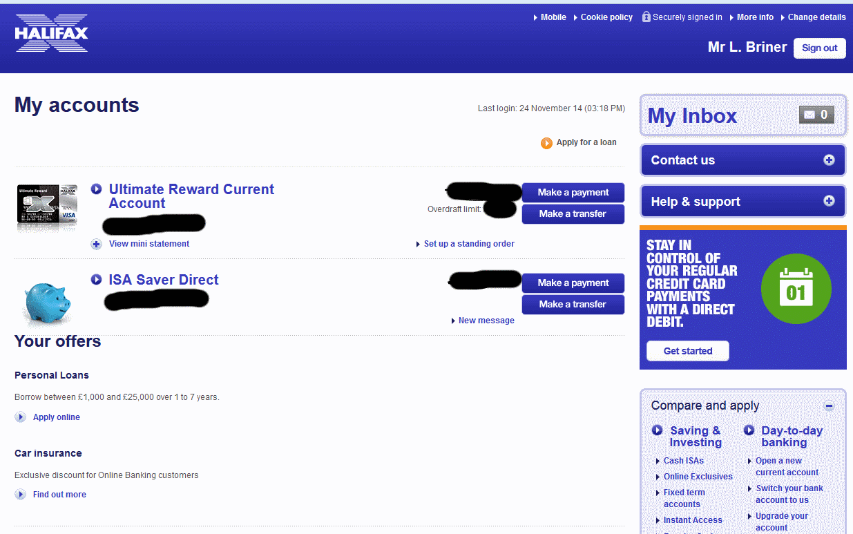
 This is actually two halves of the same screen! How many options?
Let us take a step back though. There are other examples of poor design, some are just typical crappy management issues where designs go through far too many people and far too much time to be consistent. Others are just plain wrong.
There is a line with cross-sales. Sure mention something in passing, "would you like a loan as well?" but don't rub it in my face. Honestly, this is the kind of stuff that doesn't increase sales but makes your customers fed up and leave!
Having some text saying, "securely signed in" does not make you securely signed in. Security is a number of things, including TLS (commonly called SSL) but also data being secure in transit internally at the bank and also in storage - both on hard disks and any backups. This text means precisely nothing but worse than that is that it misleads people into thinking they are secure based on the promise of the site itself. It's a bit like a shop calling itself "Quality Produce" i.e. a conflict of interest. The ONLY time these types of badges are acceptable is when they are independently audited and checkable - and there are several available - so that a customer does not have to take your word for it.
At best it is a minimal increase in security, just another 1st factor but the real rub is that it is so hard to use quickly. Scrolling through dropdown lists is not easy when they are small and you are using a mouse. Why not have boxes instead of dropdowns so I can type-tab-type-tab-type? What these are like for people with motor or sight problems I don't know.
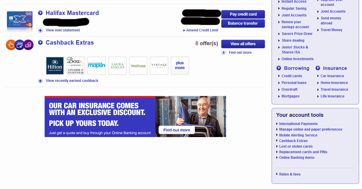
Check out this content at the bottom of the account page. How many links? How much functionality? Most of this could be pulled into other pages with simple buttons like "Search Statements" or "Export" so that the content of each can be clear and focussed. Instead, this nightmare must give people who are not confident on the web nervous shakes!
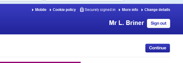
What have Halifax's Directors decided? We need to sell more stuff. What happens when I press sign out? I see this (complete with advert underneath)
So I have to press Sign out again or wait for the system to sign me out in 30 seconds. Long enough to read the advert and interestingly, plenty of time for the person behind me in the internet cafe to jump onto my computer, click to go back into my account (with no re-check of password!) and do what they want. Granted there are other checks against things like transferring money but still very sloppy and a classic example of why I want to see more legislation about what isn't and isn't acceptable when balancing security, ease of use and in this case making money as a business.
6 out of 10
What I saw was not really very impressive. After having a go at Argos the other day, I only thought it fair to point out where other people have also badly failed!
Definitely the most noticeable (and large fail) is the navigation across the site! It is ALL OVER THE PLACE. There are buttons at the left, the right, the top, the middle. There are tabs, links, text and adverts all over the place. The first rule of web design is to keep the main purpose easy and obvious, not to overwhelm the user with a 1000 possibilities.
Let us take a step back though. There are other examples of poor design, some are just typical crappy management issues where designs go through far too many people and far too much time to be consistent. Others are just plain wrong.
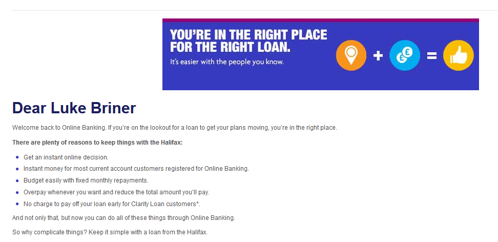
1) Welcome screen
I've just come from halifax.co.uk and been bombarded with cross-sales - the bane of the financial world. It's OK, though, I am going to login to my personal account now and what do I see? Accounts/home page? Nope, another attempt to sell me something I don't want - but of course, I will see it every time I enter the site!There is a line with cross-sales. Sure mention something in passing, "would you like a loan as well?" but don't rub it in my face. Honestly, this is the kind of stuff that doesn't increase sales but makes your customers fed up and leave!
2) Security markings
I HATE the way that sites like Halifax (and Argos) have taken it upon themselves to use fake security icons to tell their users that the site is secure:Having some text saying, "securely signed in" does not make you securely signed in. Security is a number of things, including TLS (commonly called SSL) but also data being secure in transit internally at the bank and also in storage - both on hard disks and any backups. This text means precisely nothing but worse than that is that it misleads people into thinking they are secure based on the promise of the site itself. It's a bit like a shop calling itself "Quality Produce" i.e. a conflict of interest. The ONLY time these types of badges are acceptable is when they are independently audited and checkable - and there are several available - so that a customer does not have to take your word for it.
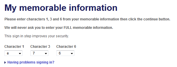
3) Memorable Information
All secure sites have worries about logins. Passwords are generally not acceptable by themselves and whereas some banks have issued hardware tokens for their customers, Halifax has decided to use "Memorable Information", basically another password but which you only enter some of the characters of.At best it is a minimal increase in security, just another 1st factor but the real rub is that it is so hard to use quickly. Scrolling through dropdown lists is not easy when they are small and you are using a mouse. Why not have boxes instead of dropdowns so I can type-tab-type-tab-type? What these are like for people with motor or sight problems I don't know.
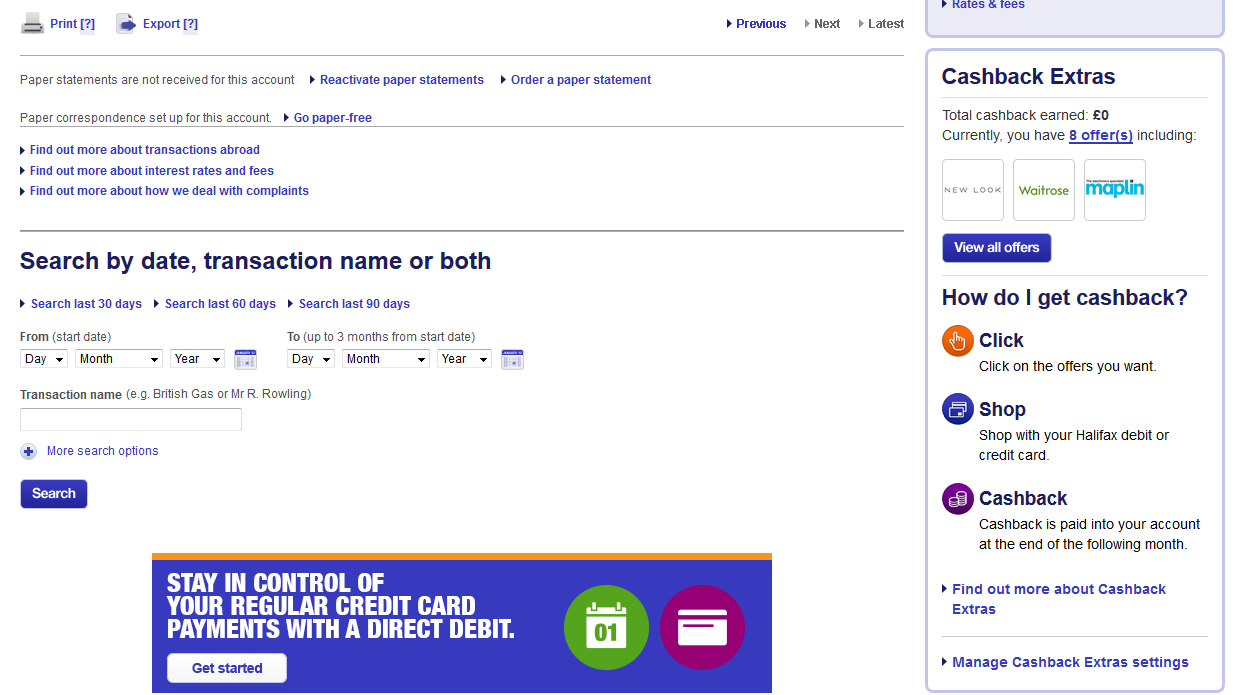
4) The bottom of the account page
Check out this content at the bottom of the account page. How many links? How much functionality? Most of this could be pulled into other pages with simple buttons like "Search Statements" or "Export" so that the content of each can be clear and focussed. Instead, this nightmare must give people who are not confident on the web nervous shakes!
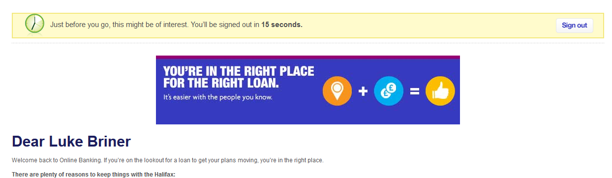
5) Sign out
This is by far the WORST example of the site from a security perspective. When you click sign out (bearing in mind that people often don't anyway), there is only thing that is permitted. Wipe all the session data, delete cookies and sign out - full stop. It shouldn't even check that you're currently logged in because if it does, that could fall over and cause some error - just delete all the session data and ideally go to a home page.What have Halifax's Directors decided? We need to sell more stuff. What happens when I press sign out? I see this (complete with advert underneath)
So I have to press Sign out again or wait for the system to sign me out in 30 seconds. Long enough to read the advert and interestingly, plenty of time for the person behind me in the internet cafe to jump onto my computer, click to go back into my account (with no re-check of password!) and do what they want. Granted there are other checks against things like transferring money but still very sloppy and a classic example of why I want to see more legislation about what isn't and isn't acceptable when balancing security, ease of use and in this case making money as a business.
Conclusion
Not as bad as Argos who had loads of rendering and performance problems but also some major fails for such a big brand. At least the language in the security information page sounds like it was written by someone who knows what they are talking about (unlike Argos!)6 out of 10